ShareFoods
Website redesign for ShareFoods, a 1+1 giving-back brand, following an identity rebrand
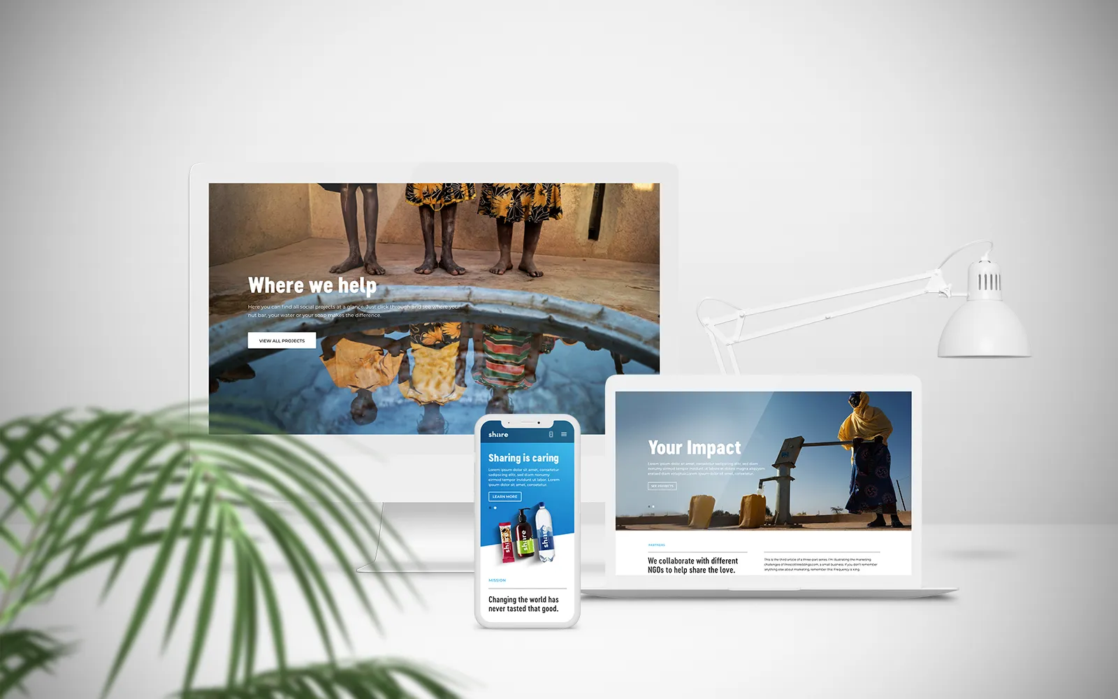
ShareFoods is an organisation that sells products with a 1+1 principle — for every product purchased, it gives back to a person in need. Following an identity rebrand, ShareFoods required a website redesign that was clean but playful, respecting the new CI.
Website redesign
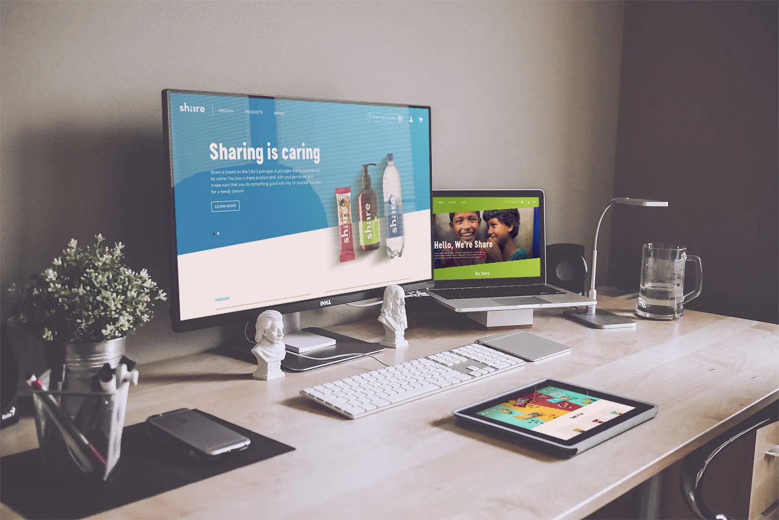
ShareFoods is an organisation that sells products with a 1+1 principle. For every product purchased by consumers, it gives back to the community and helps a person in need. Following an identity rebrand, ShareFoods required a website redesign. The overall look and feel had to be clean but playful with graphics and colours, respecting the guidelines of the new CI.
MY ROLE
I was part of the team responsible for the initial re-design of the brand's website. My role included structuring of the user journey, organising the site map and putting together the design based on the requirements and align with the look and feel based on the rebrand guidelines.
Sitemap
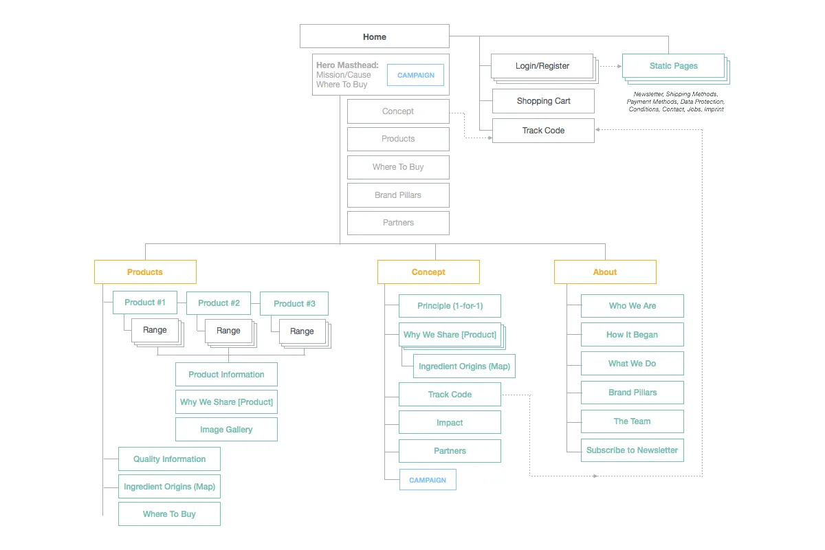
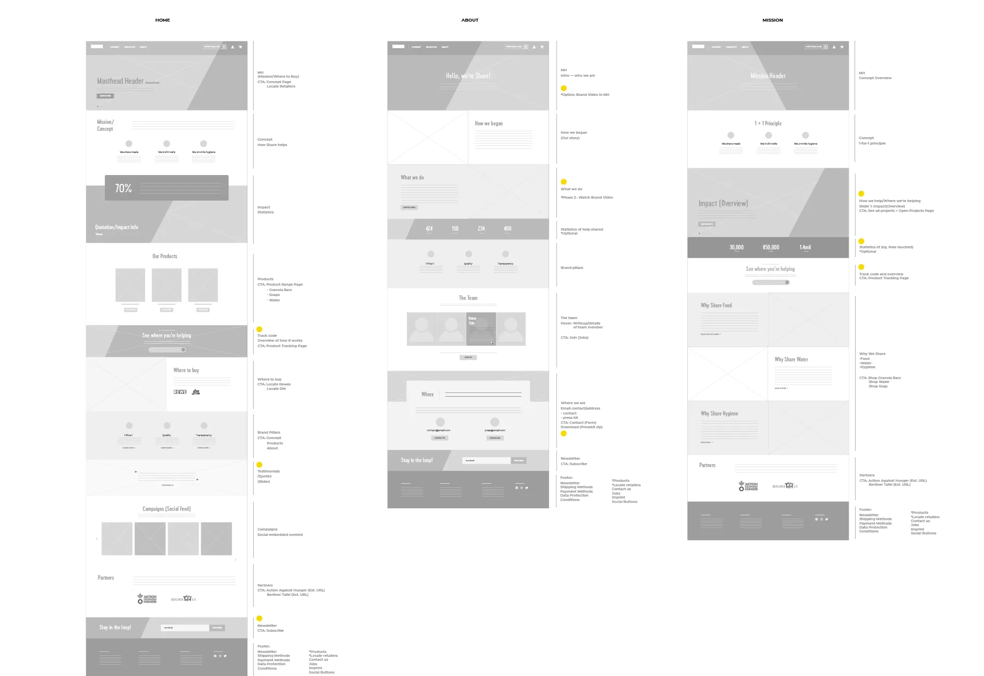
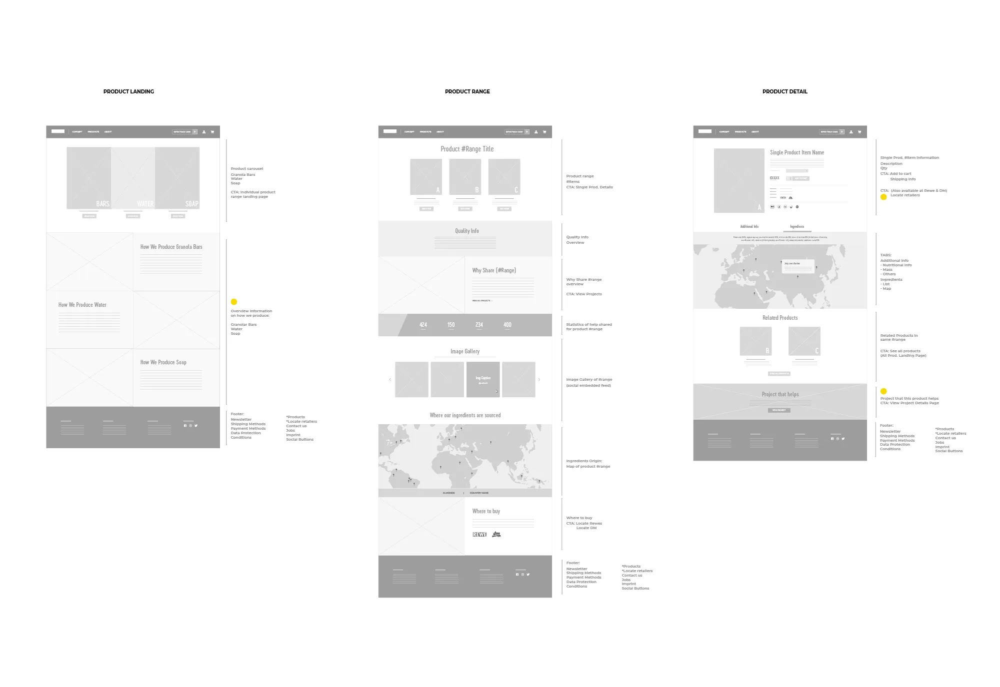
As new sections were introduced for the site, thorough planning had to be done to highlight features that were prioritised such as the product QR codes that consumers could scan to find out how they are helping. Many of these added sections lead to a third level page with detailed information.
These sections also included multiple maps, statistics and many other features. Proper planning of the user flow had to be analysed to ensure that users would not be confused by the different tiers of the page. It was also necessary to prevent multiple pages with the same content and minimise load time altogether.
Colour & Identity
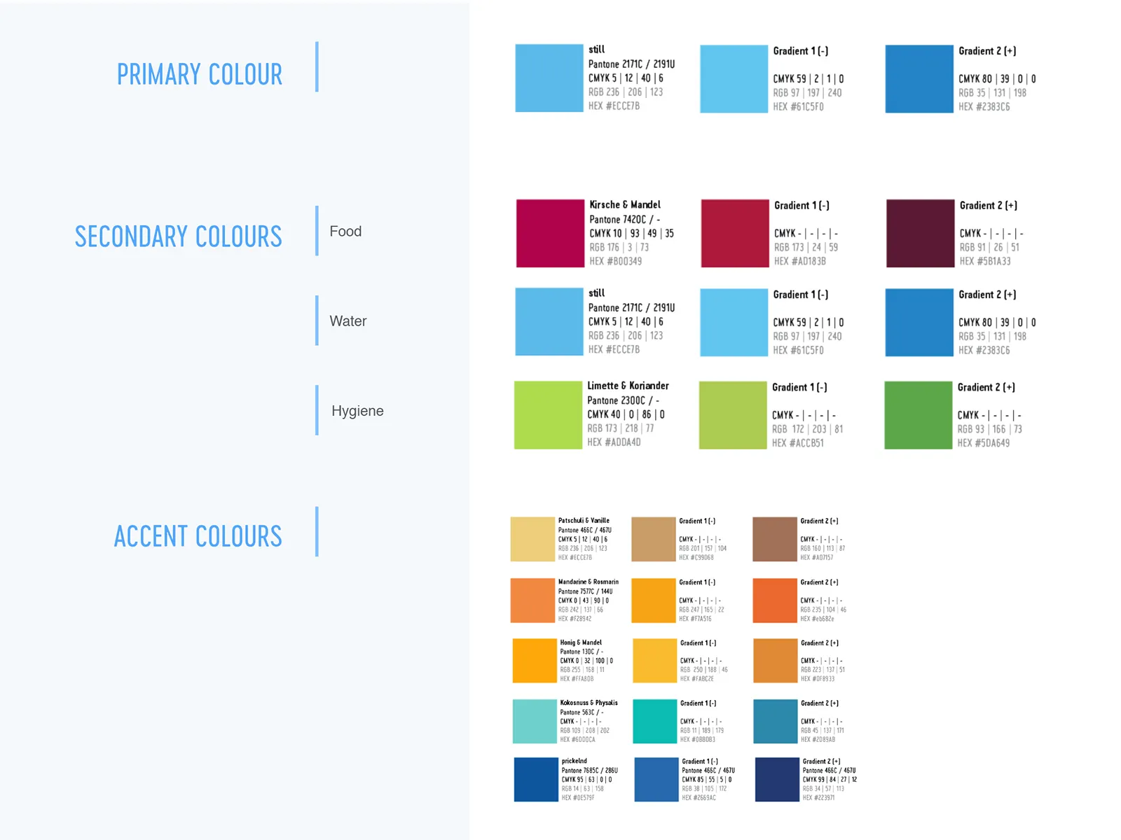
Keeping to the rebranded CI, I implemented a colour guide that would maintain organisation of the different sections within the site. The colour guide was not only used for the site, but also for any assets that the brand required for campaigns.
Wireframing
One of the technical requirements of the site build was that it had to be done over WordPress CMS. I researched several templates to find the most suitable one that had dynamic components which fit the content and aligned with the CI.
Working closely with the development team, I put together wireframes based on component compatibility with the desired theme and this aided the process of development. The design concept also had to adapt well to a functional responsive site.
Visual Concept
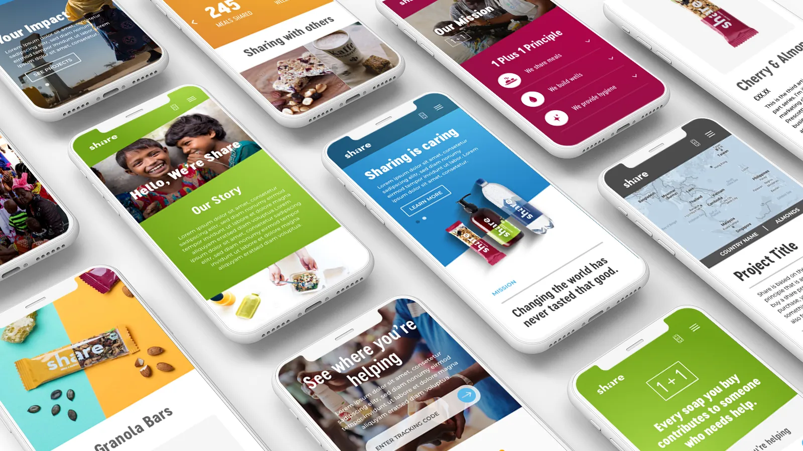
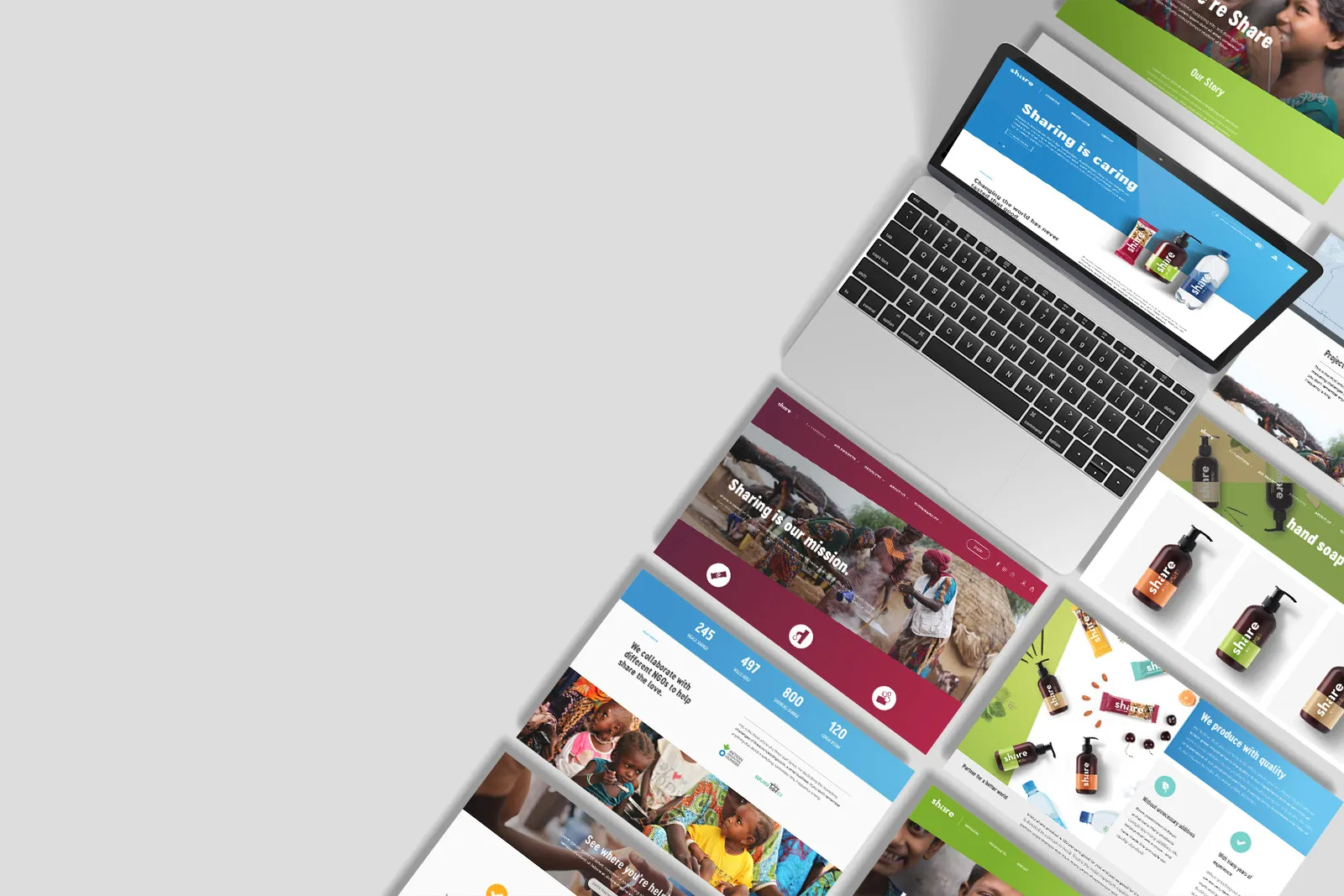
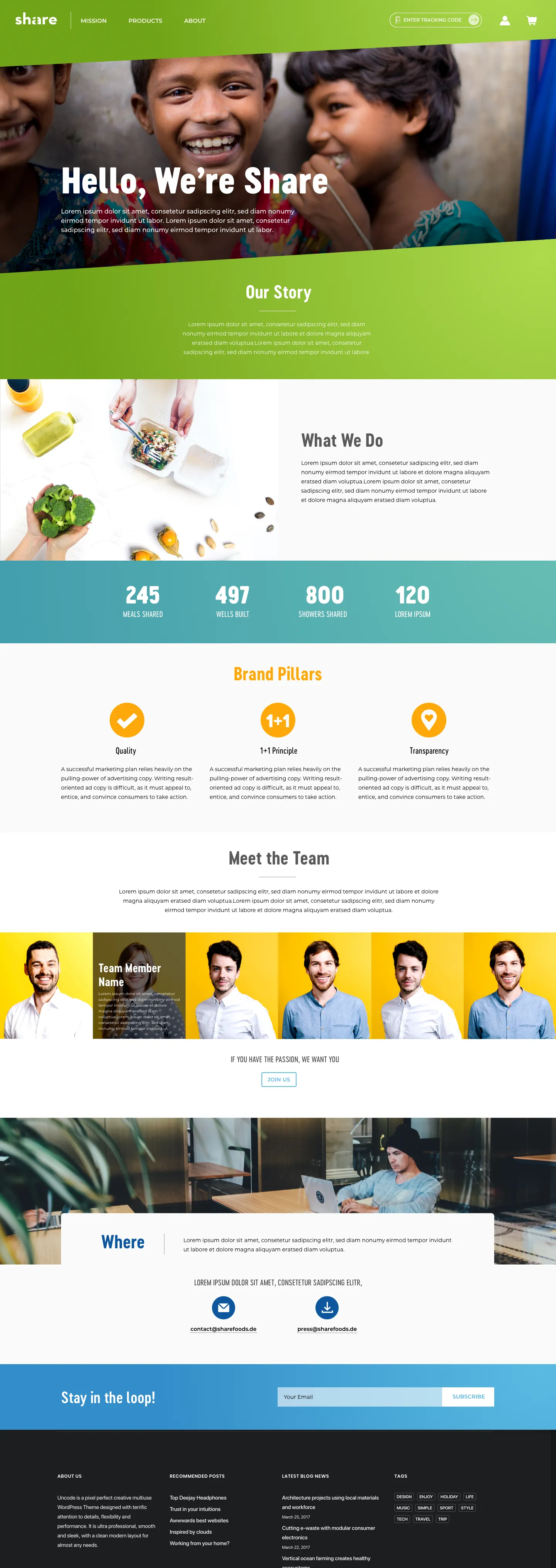
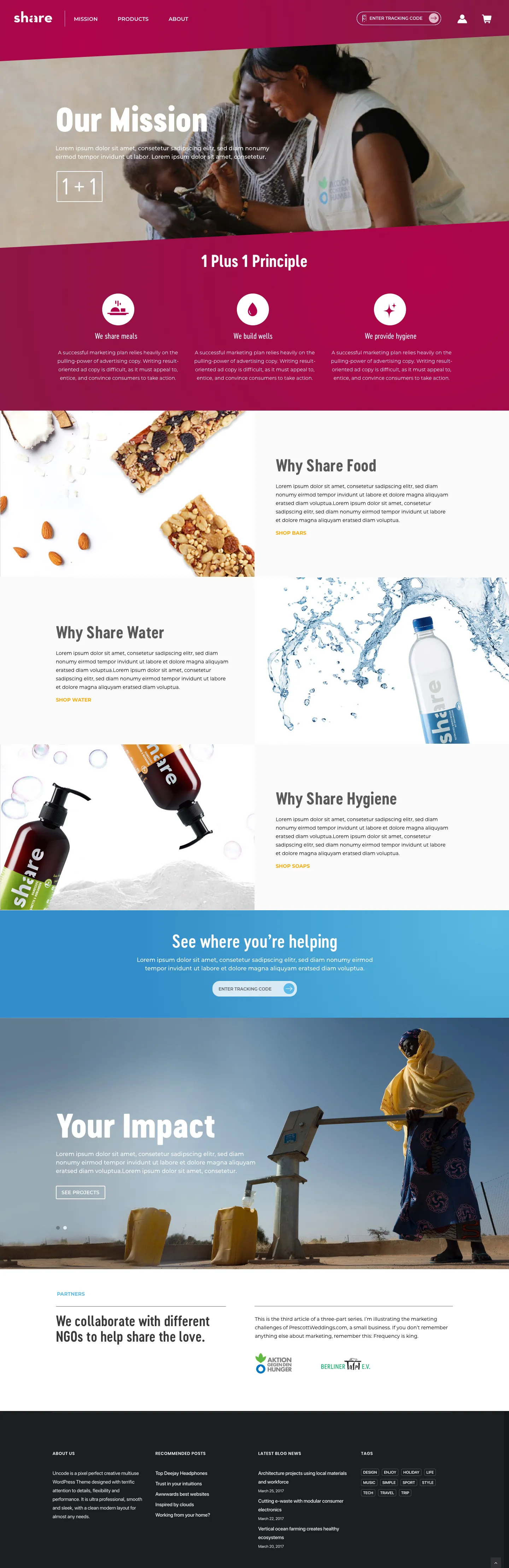
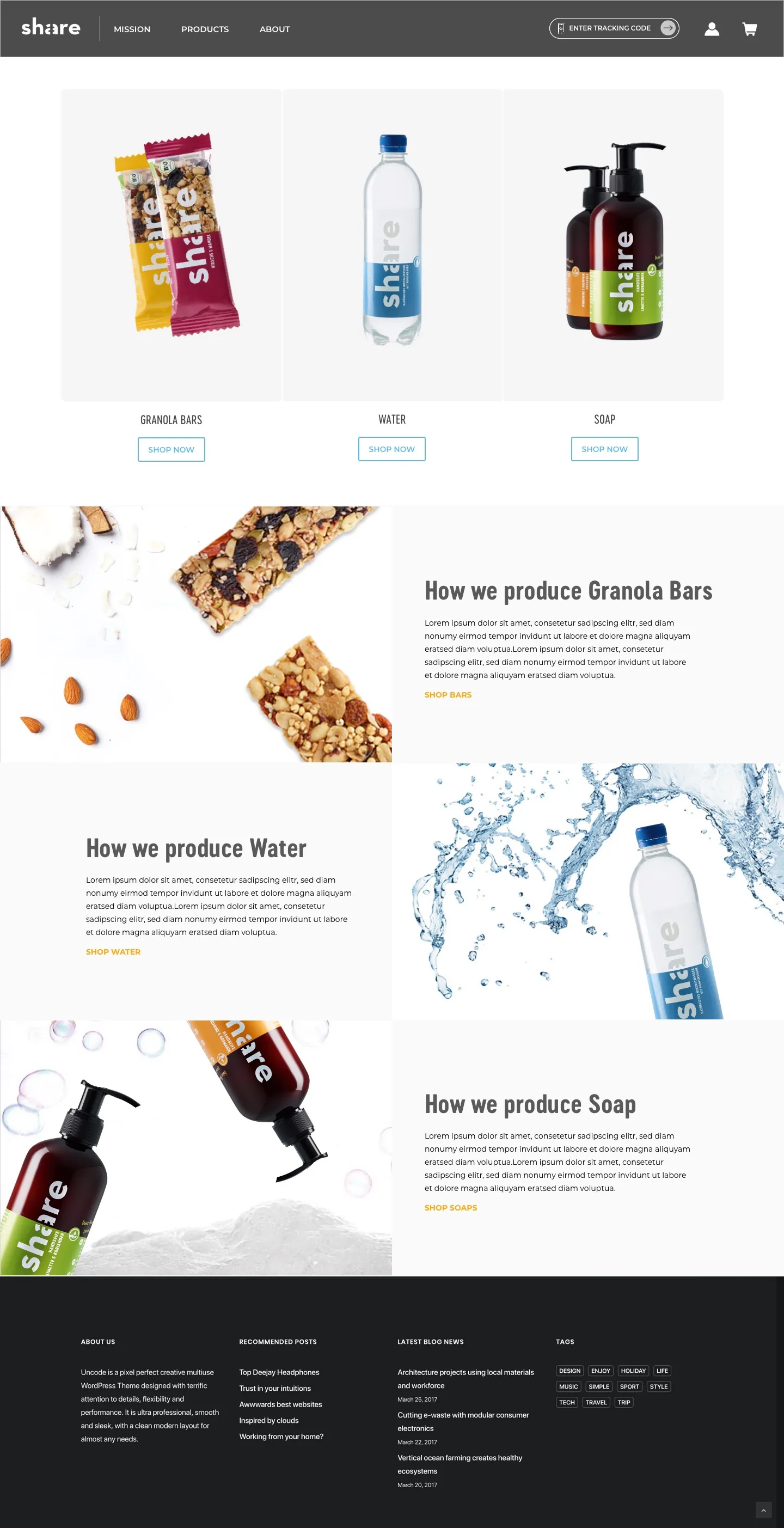
Following the rebrand, the integration of a colour-block diagonal mask was a requirement to align with all other collaterals. Additionally, I proposed a clean flatlay concept that could complement the strong visual photography from the NGOs.
Scan & Track
where the product gives back to
As a QR code exists on every product from ShareFoods, majority of users are expected to access the site on their mobile devices. This meant that the content and design had to be based on a mobile-first concept. Previously when scanned, QR code leads to a page where it does not display project directly and users had to manually enter the code.
The solution allows scanned codes to show relevant products, and offers a compressed view within initial load that summarises information to consumers.
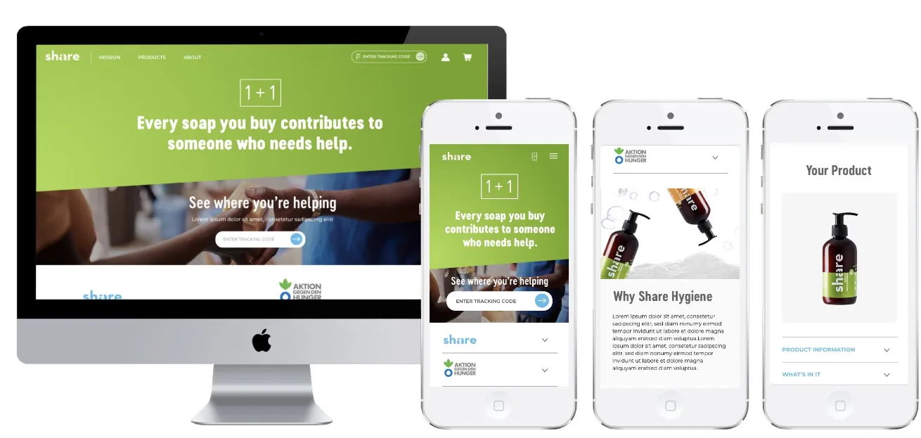
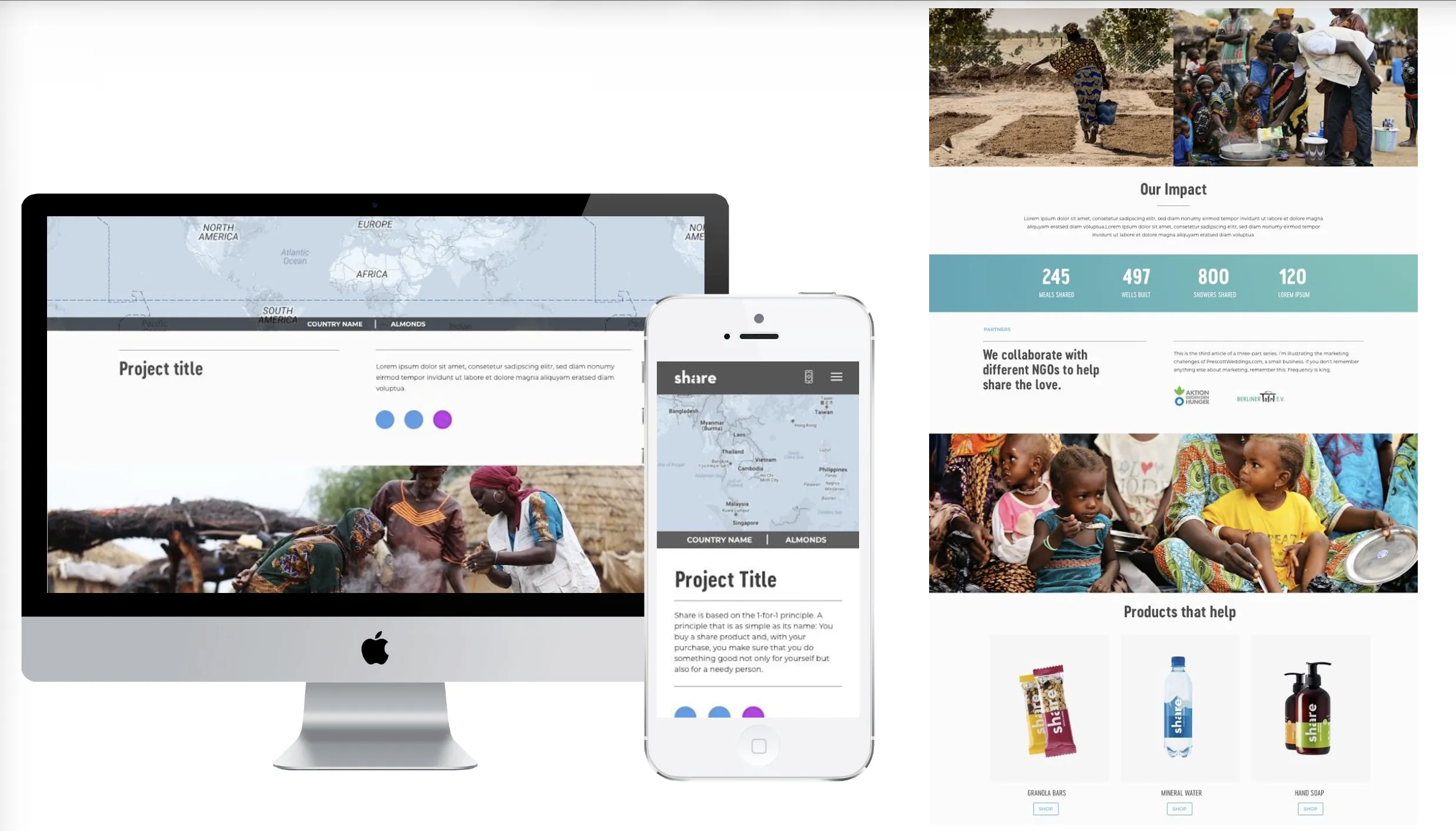
Integrating a responsive design