
Project Simplify
Revamping StarHub's online store purchase funnel to simplify the journey and decrease drop-off rates
To enhance the existing online store purchase experience and address customer pain points, with the goal to increase digital sales %, transaction volume and decrease drop off rates. The information architecture of the purchase funnel was revamped and the UI was relooked to improve site performance and simplify the customer experience.
MY ROLE
I was the lead designer on this project; working with product owners to improve the information architecture, mapping out an enhanced customer journey and user flow while maintaining frequent feasibility checks with developers. I also ran an unmoderated A/B test to validate interaction crossroads, worked on the UI design to align with the design system - including documentation of UI states and components for development handoff.
Research
PRODUCT DEEPDIVE
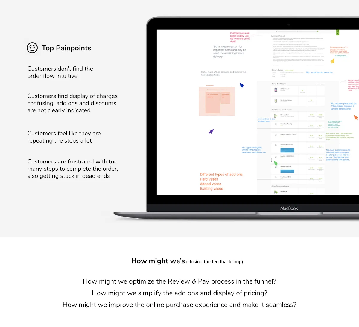
Identifying pain points from NPS, analysing activity map for current user behaviours, assessing Adobe Analytics for drop off rates per customer type.
I ran a workshop with stakeholders to better understand perspectives from product owners and CX team
Adobe Analytics showed the funnel losing most users early — only ~10.5% reached the final step.
Source: Adobe Analytics, pre-redesign funnel.
It took me 7 tries to process the recontract — every time I select Details and move back, it kicks me out and I start over.
Wireframing
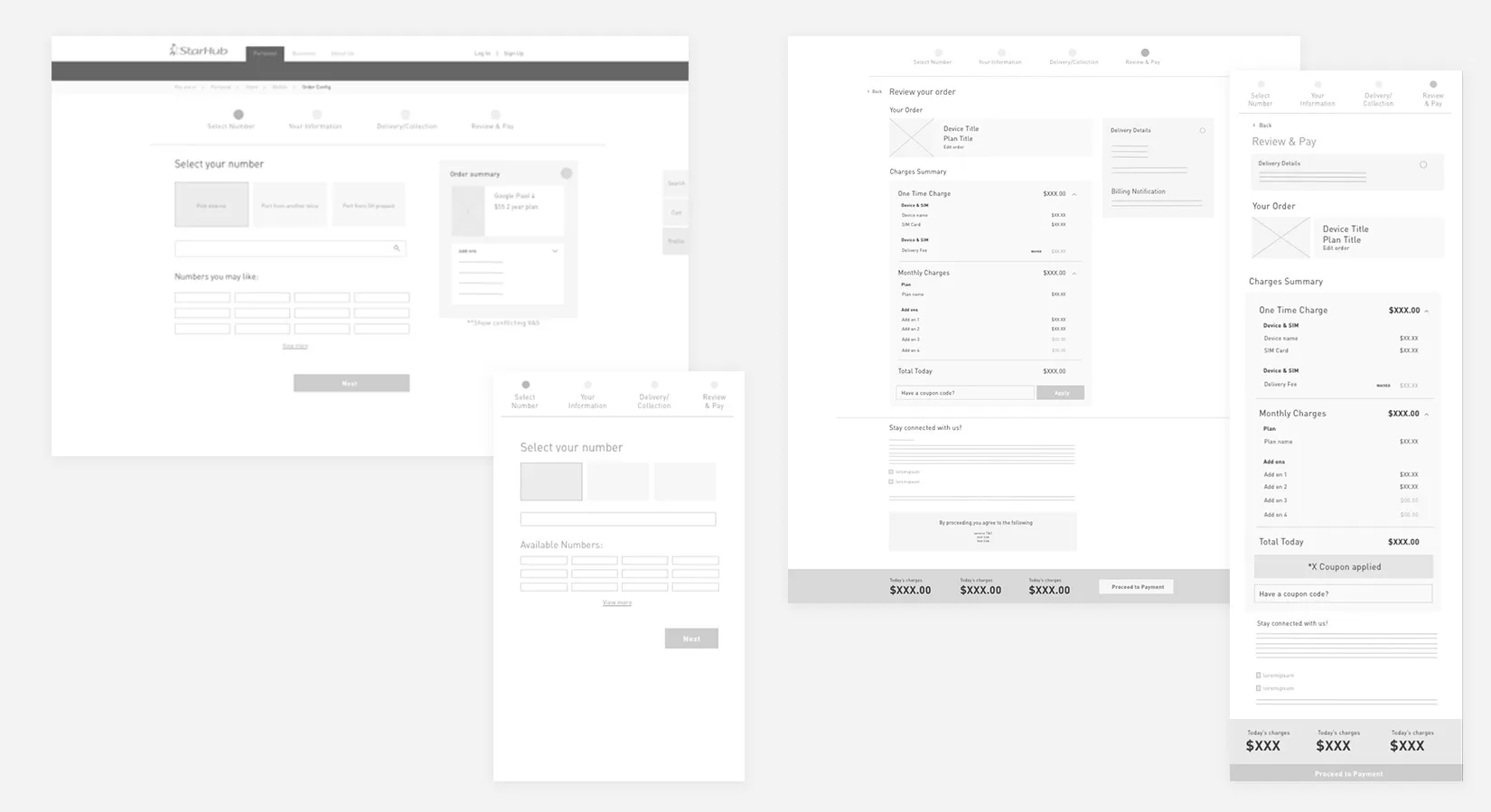
Addressing all the different customer journeys and flows, covering for all scenarios and types of customers (recontract, existing new, new new)
Validating the amendment process
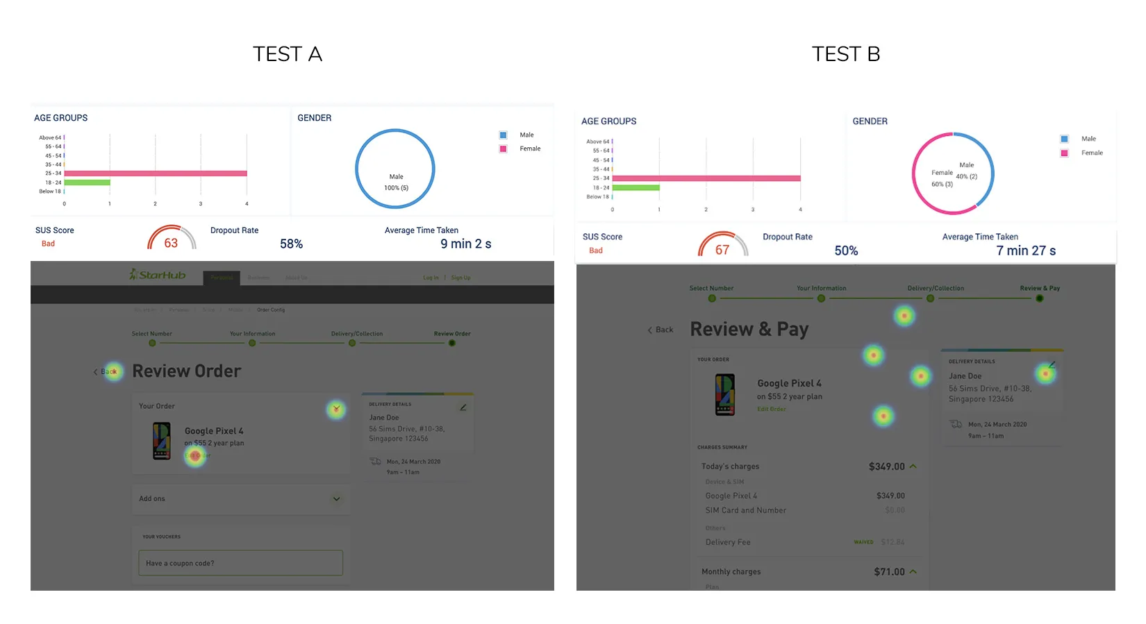
Using mid-fidelity wireframes, an unmoderated A/B test was done to confirm user's behaviour to amend products in cart, or move backwards to edit the order. This was to aid and validate different interactions in order to assess which fared better in terms of usability.
Problem statement:
“At the end of this, I should be able to identify user behaviour of customers around their need to amend a mobile device+plan in the sales funnel"
TEST FINDINGS
- Test A (editable review page) fared better — users didn’t have to go back and forth in nested pages
- Both tests justified the use of the order summary card
- An edit icon fared better in terms of visibility than a text link
- Progress bar: in Test A people clicked it to find the order summary; in Test B almost nobody needed to
- The back button was hardly used in either test
Design objectives
Leveraging on the design system, I had to design for an optimised mobile experience with the consideration of accessibility. The key objective was to lead customers through the purchase journey with no road blocks or confusion.
CHALLENGES
- Need to maintain consistency with other LOBs (projects happening concurrently) - A template had to be created through detailed assessment of all permutations, looking ahead with foresight to prevent downstream design challenges
- Tech constraints surfaced midway through sprints - rethinking logic while still considering product construct
Project handoff
After stakeholder walkthrough of the high fidelity E2E flows, the project was delivered to the development team via Zeplin, and this included an in-depth documentation for key components, states & specs.
As this project was delivered in Agile for development, sprint reviews included development updates, UI checks and UAT assessments.
Outcomes:
1. Decrease drop off rates
- Optimising funnel journey with clear steps
- Introducing dynamic steps in the progress bar to show what is relevant to customers
- Improving content placement by removing unnecessary steps
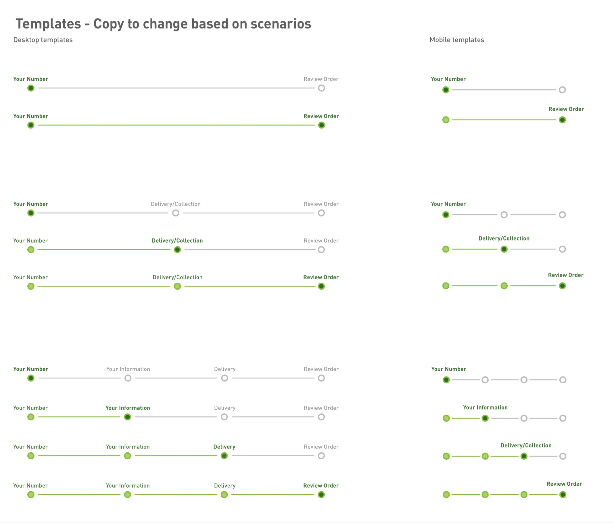
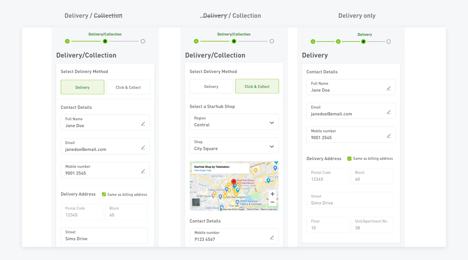
2. Eliminate the need for customers to repeat steps or start over
- Enhancing the progress bar interactivity, allowing customers to return to previous steps
- Allowing customers to edit their order and return to saved data in steps of the funnel
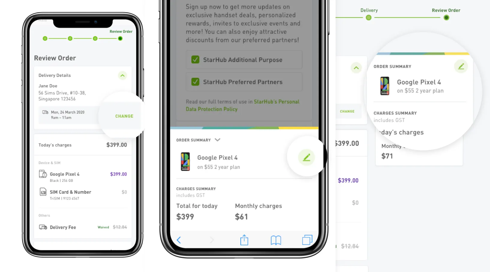
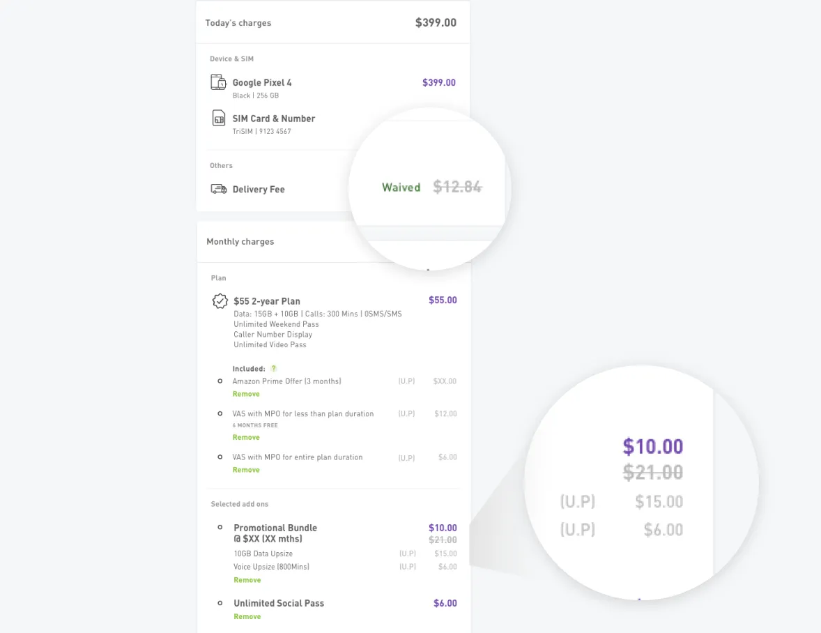
3. Improved pricing display
- Remaining transparent with charges
- Introducing visual hierarchy with the use of colour and typography so customers can better identify chargeable figures vs non chargeable figures
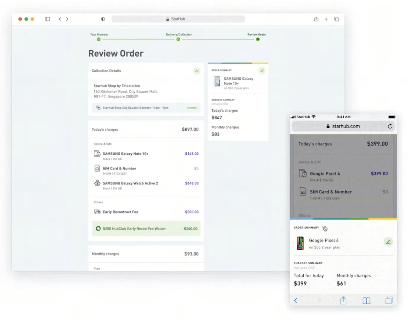
4. Provide better usability
- Creating a seamless mobile optimised experience
- Leveraging the design system components
- Improving user interaction
After launch
Three months after launch in a post-launch assessment with analytics, NPS and time-on-page data to check how the redesign was performing.
- Order volume held steady: orders in the three months after launch did not fall below the pre-launch baseline, for both new-acquisition and recontract sales, despite restructuring the entire funnel.
- Page-level drop-off looked higher at the new Review & Pay page (~50%), but this was the old "Your Order" step's ~70% drop-off moving to a new page in a changed sequence — not a like-for-like increase.
- Digging into time-on-page and NPS showed most of that drop-off was price-previewing behaviour, not a usability regression. I recommended a cart/save entry point so customers could return to an order without redoing the funnel.
Key learnings
- Importance of having foresight for downstream impacts on other products
- Necessary alignment with developers to check feasibility since upstream is waterfall but downstream production is Agile
Opportunity areas
- Display gratification and value saved in discounts & promotions
- Potential to improve document upload features by implementing auto-fill sync up