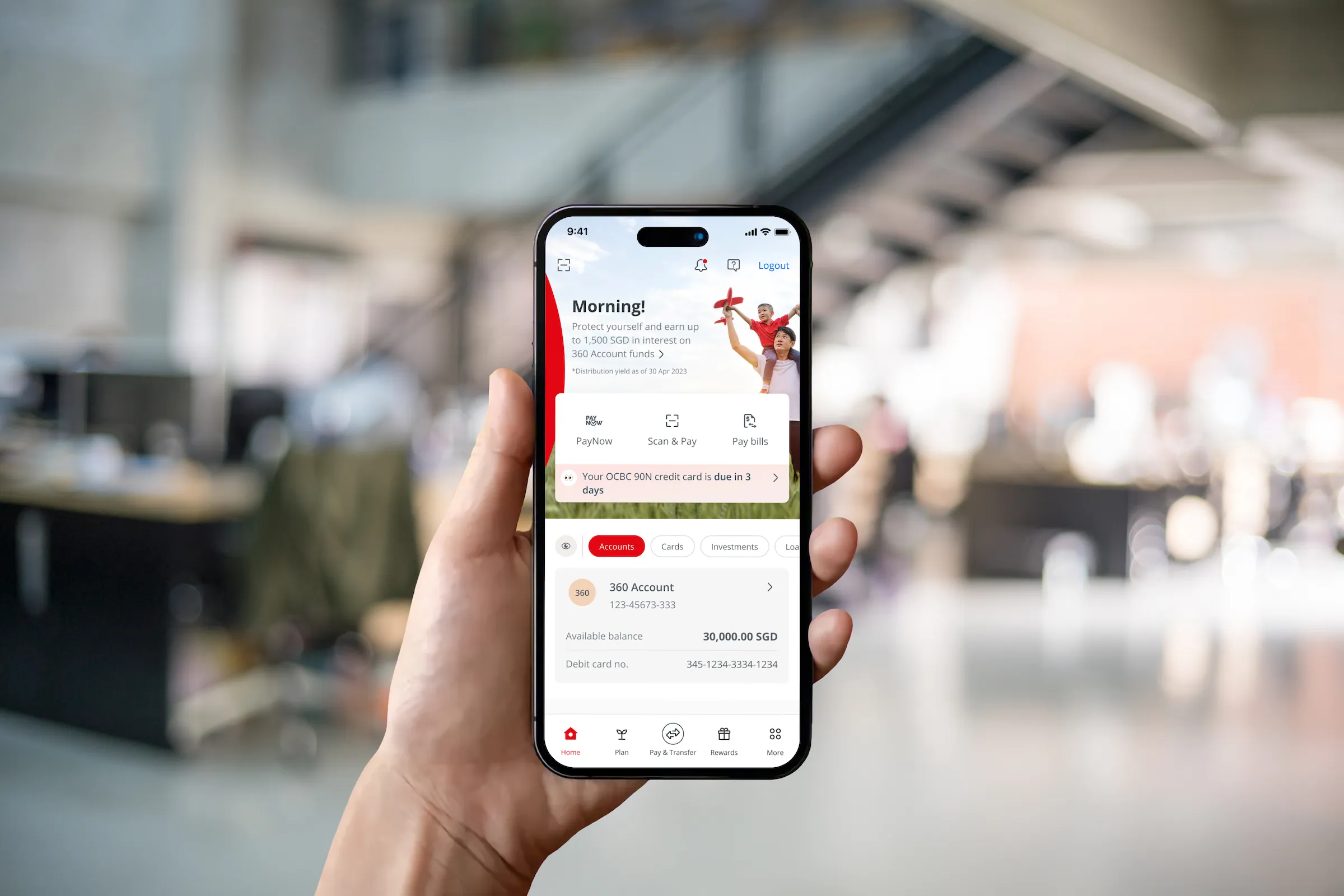
OCBC Banking App Refresh
Mobile banking app dashboard refresh to improve customer experience and support regional expansion
The OCBC mobile banking app went through a refresh, primarily to improve customer experience with various objectives in mind. The project also integrated a new design system, customer journey and features, and in later phases was adapted for market regionalisation in Hong Kong and Malaysia.
MY ROLE
I was part of the Experience Design team, working primarily on the squad that focused on app dashboard and personalisation flows. This included overseeing the regionalisation for the app's adaptation in the Malaysian market. My contributions also extended to the development of the design system and establishing the visual design (icons and illustrations) across the app, as well as alignment across all squads in the XD team.
What data showed us
71.3% of personal banking customers own only 1 of 6 product groups
This underscores the potential to promote greater product adoption, ultimately leading to increased customer loyalty and profitability.
82% respondents face difficulty in finding what they want
- (from 2022 Qualtrics survey)
There is a substantial problem with the usability or information architecture of the OCBC Banking App.
This high percentage indicates that a significant majority of users are encountering challenges when trying to locate the information or content they are looking for.
Key objectives
- Revamp the way OCBC organise products & features in the app to improve discoverability
- Deepen engagement for existing customers
- Allow for personalisation and targeted content display
Co-Creating with stakeholders
There was a co-creation workshop held to define the Information Architecture. This was held with different departments to collaborate and ensure less friction in decision-making.
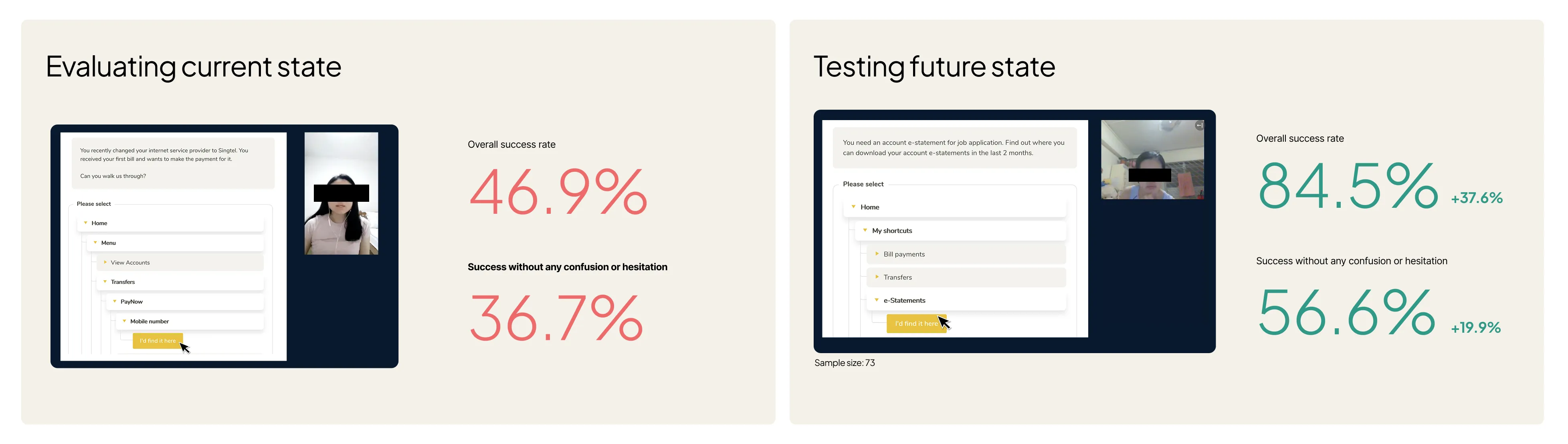
User research with prototypes and concepts
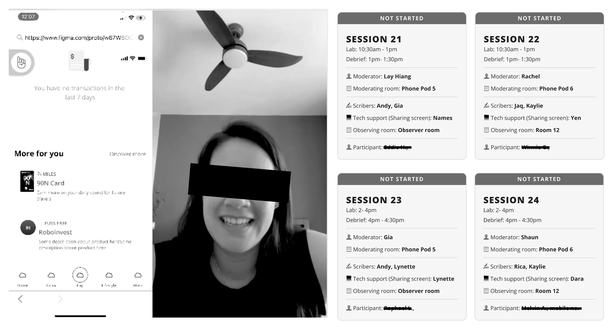
We held weekly research sessions with customers to have them test prototypes that showcase the new IA and features. This helps us to understand if usability or find-ability can be improved or if there were any issues.

Overview of Dashboard L1 and L2
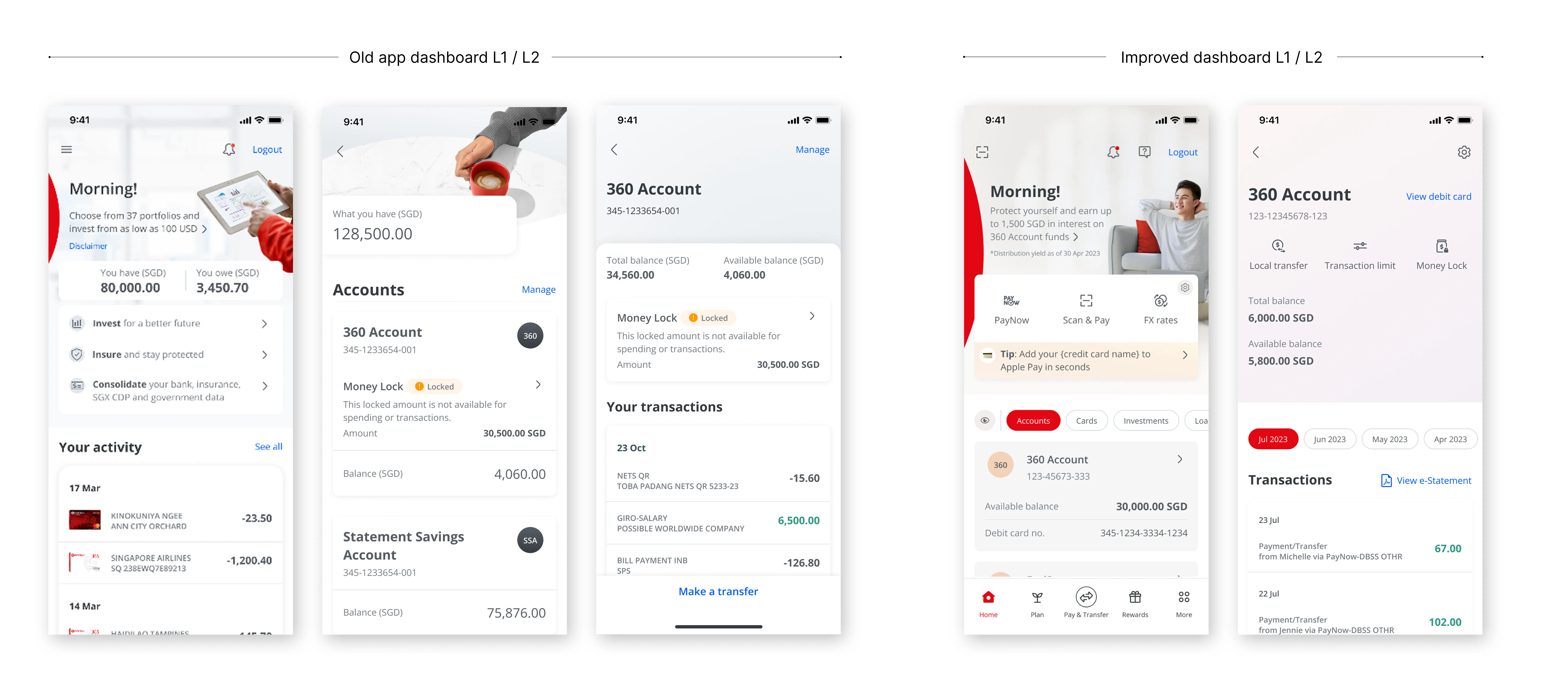
WHAT'S IMPROVED:
Problem
Old design relied on a cluttered hamburger menu.
Solution
- New sticky bottom nav organises categories, while top nav highlights primary actions.
- Added a customisable quick action bar with three most-used features.
Problem
Users had to drill down to Level 3 to view products.
Solution
- New design surfaces all product groups upfront, with adopted ones prioritised.
- At Level 2, products are shown as cards for better clarity; order later made customisable.
Problem
Balances and card numbers were always visible, creating privacy concerns.
Solution

- Introduced a one-tap Privacy Mode to mask sensitive info.
- Highly valued in testing, boosting trust and comfort.
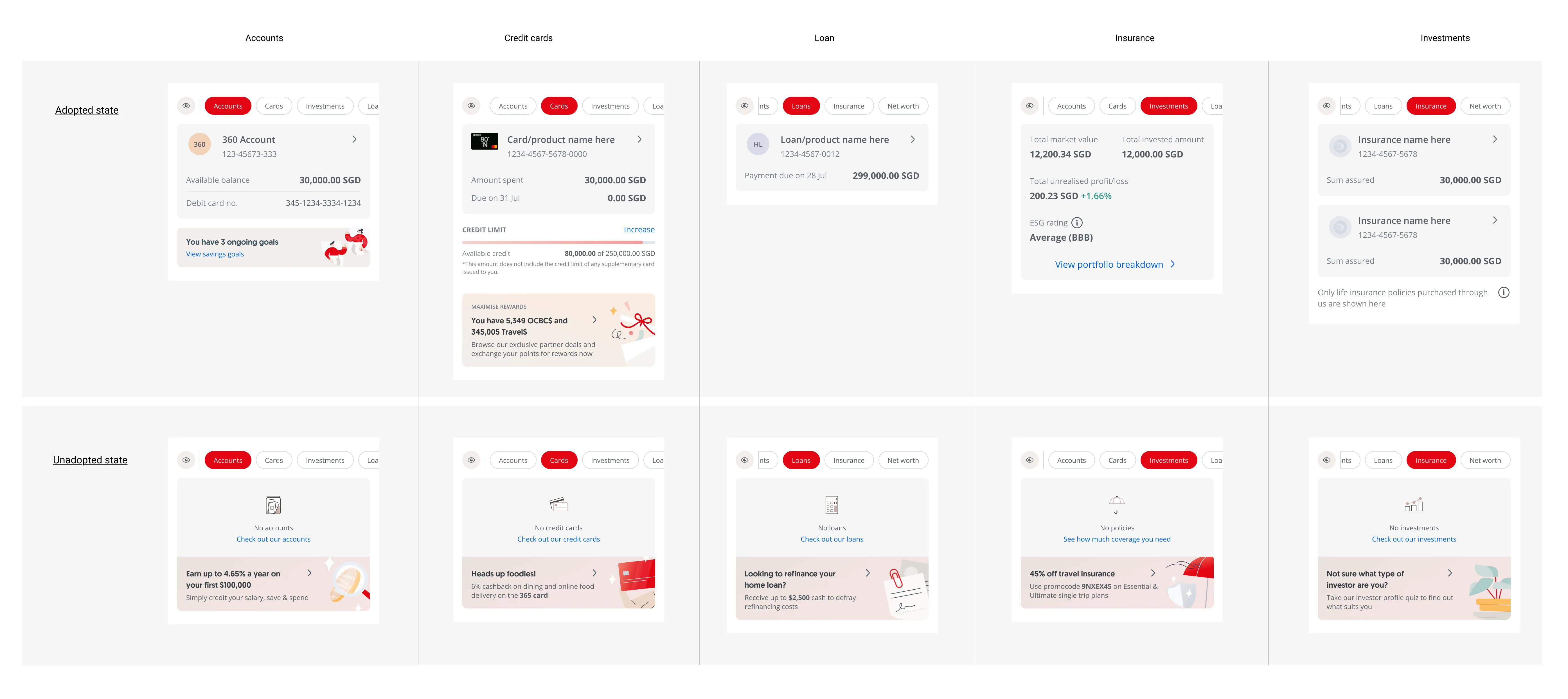
Opportunity for Product Uptake
By displaying all product pills upfront, we surfaced opportunities to drive adoption of products customers don’t yet hold. Owned products: Show current holdings. Unowned products: Highlight as opportunities with contextual banners and prompts to guide adoption.
Personalised content

Personalisation in banking goes beyond convenience, it builds trust and drives adoption when users see content relevant to their needs. Our goal was to make the app adaptive, surfacing content based on user behaviours, goals, and existing products rather than a one-size-fits-all layout.
Research revealed banking is perceived differently: some treat it as a basic utility, while others use it as a tool for achieving financial goals.
To support both mindsets, the new design delivers different content to different customers, tailored from factors such as current product adoption, usage patterns, and relevant utility actions.
Dashboard content types:
-
Top banner: Marketing campaigns (full-width)
-
Utility banner: Alerts, reminders, and key information (linked to quick action bar)
-
Curated tiles: Recommended products to encourage adoption
Customisable Display

- Quick action bar: Users can pick their most frequently used actions
- Product display order: Users can decide what they want to see first (i.e Accounts, or cards etc)
Catering for dynamic content
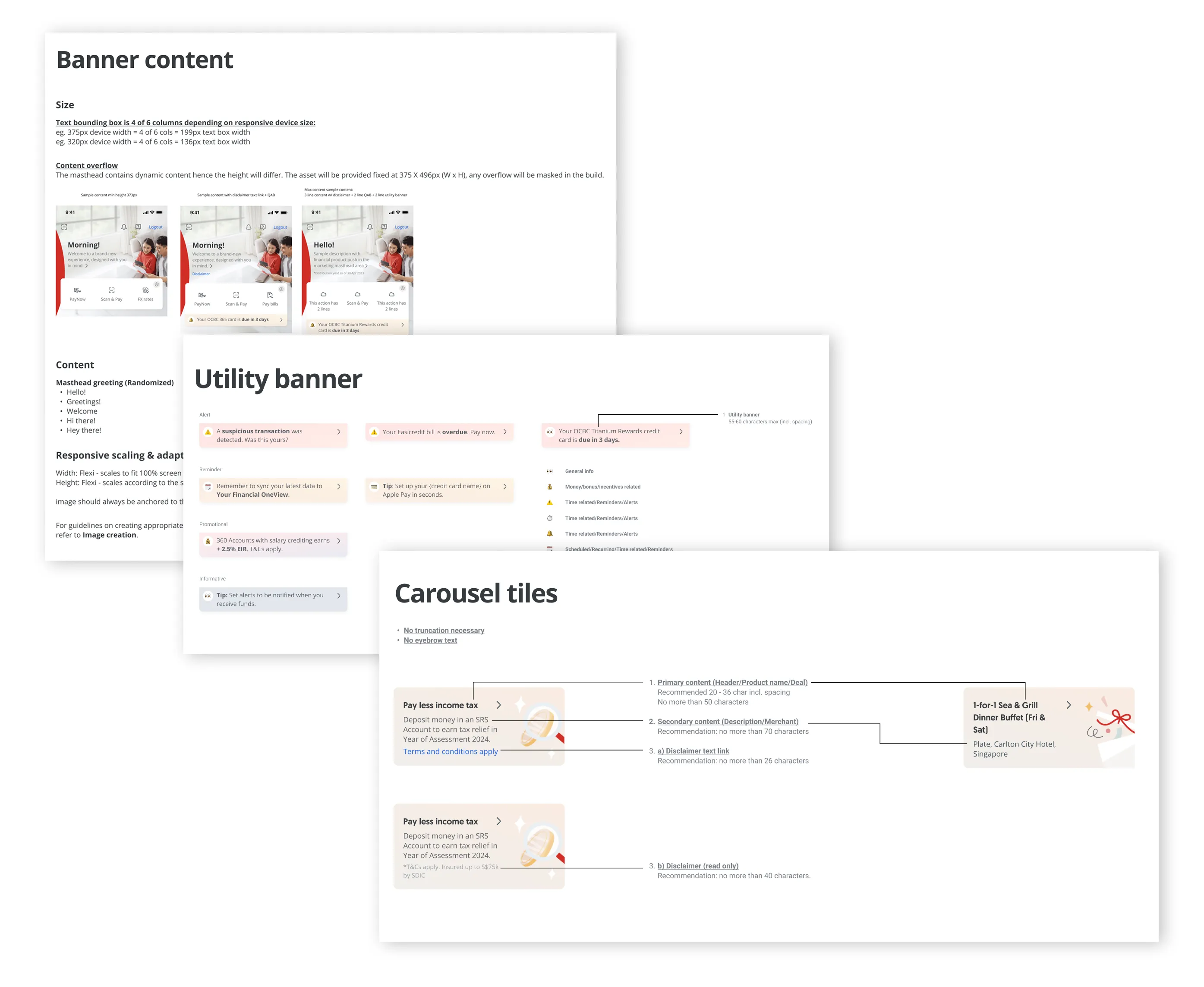
We treated the dashboard like a modular canvas — each component had clear rules of engagement. This included detailed documentation of use cases, constraints, and best practices to maintain consistency across the app.
With these established guidelines, it gave business units freedom to utilise these components with dynamic content while still preserving a cohesive user experience.
Coachmarks
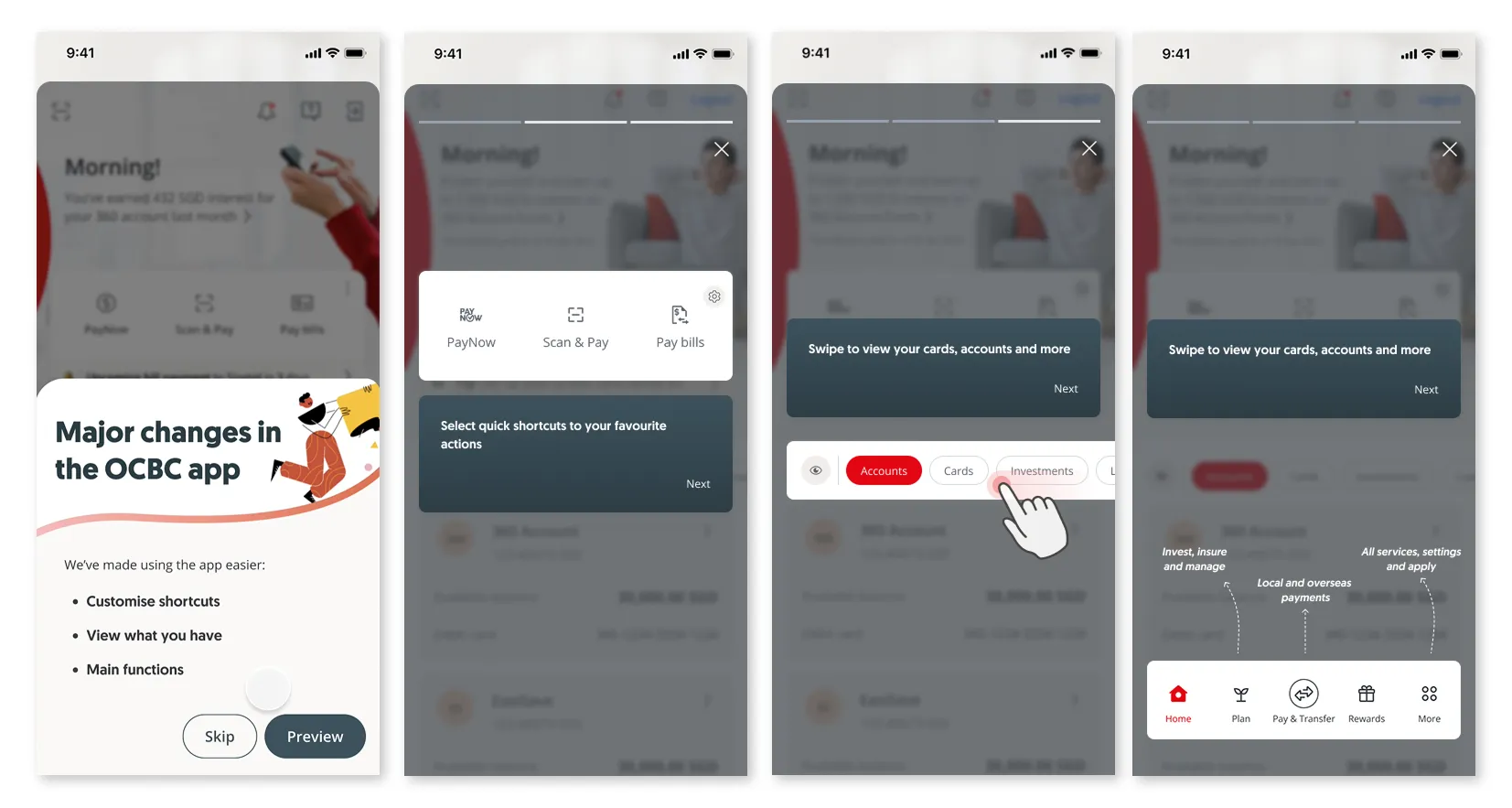
With a major redesign, we anticipated friction for existing users accustomed to the old interface. To ease the transition, we introduced coachmarks at launch, guiding users through key navigation changes and highlighting new features.
For the more intuitive interactions, we intentionally left room for self-discovery, balancing guidance with exploration to encourage familiarity and engagement.
Regional adaptation for Malaysia market
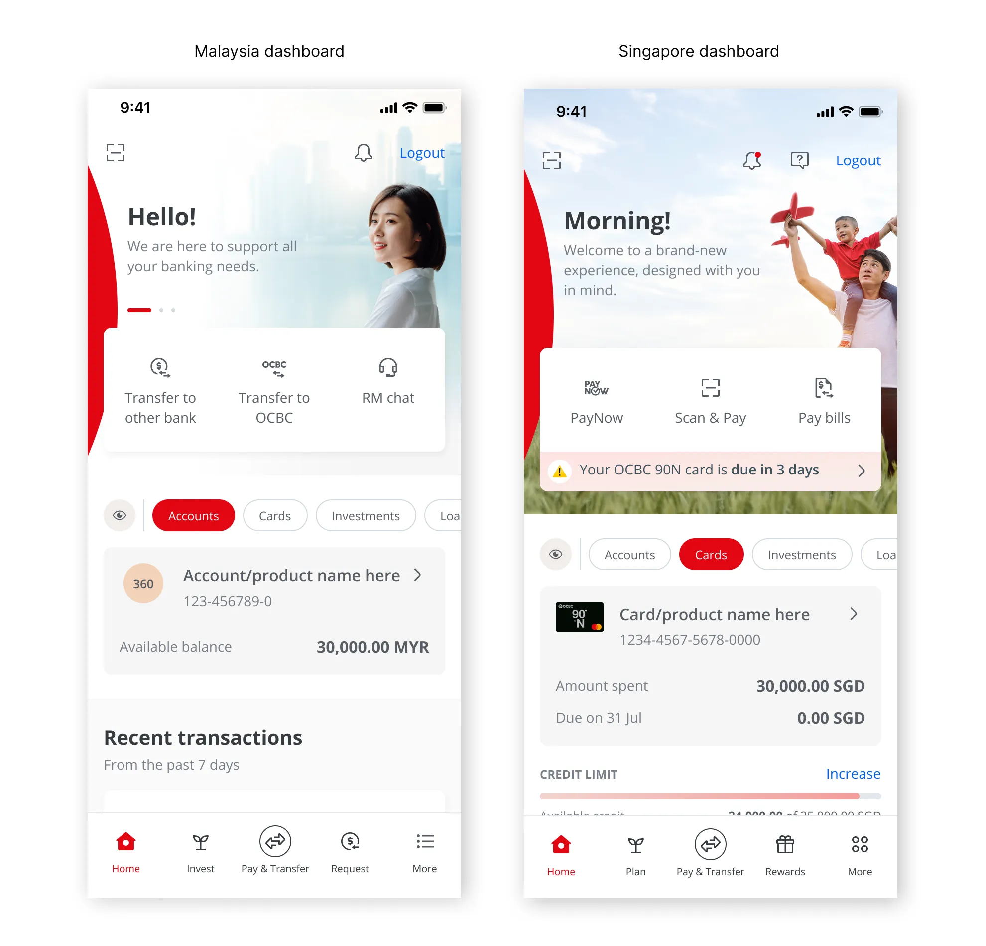
With the launch of the new app, regional adaptations were required for Malaysia, Hong Kong, and Indonesia. I co-led the adaptation for the Malaysia market.
Because customer journeys and product offerings vary across countries, the following steps were taken to ensure scalability and local relevance:
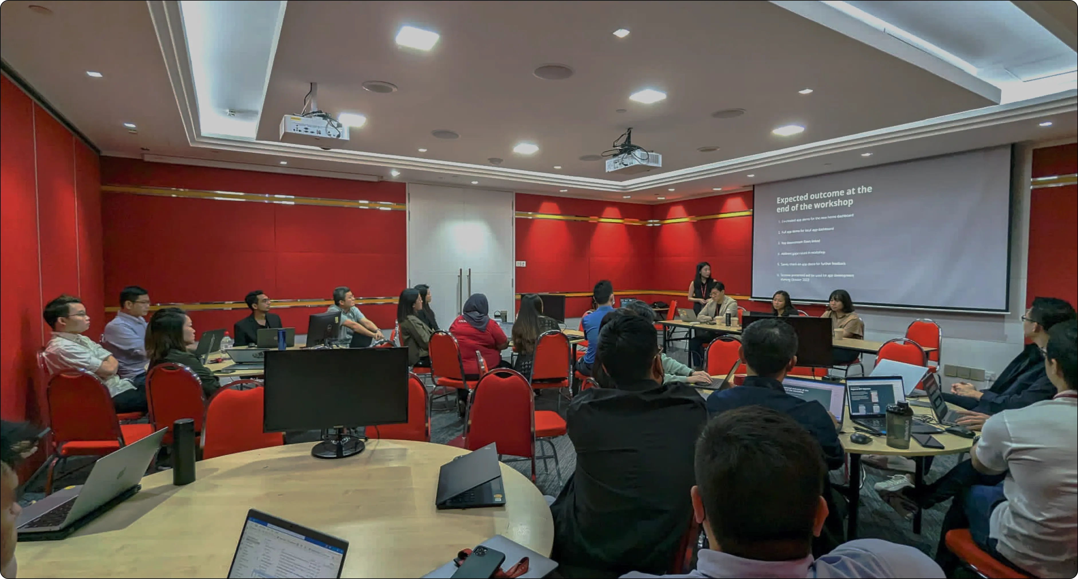
- Facilitated regional workshops with stakeholders and teams in Kuala Lumpur.
- Conducted a customer journey review to align flows with the needs of Malaysian users.
- Adapted screens and interfaces to reflect market-specific requirements.
- Coordinated with development on implementation and backend integration to ensure compatibility with existing systems.
Outcomes
- Tailored build: Scoped and adapted features, creating a streamlined version for Malaysia to match local requirements.
- Localised money movement: Replaced PayNow with DuitNow and adjusted related flows.
- System-aware design: Adapted the build to Malaysia’s legacy backend constraints.
- Hybrid implementation: Combined new pages with BAU pages while improving visual consistency across both design systems.
Impact
Post-launch results (Sep–Oct 2024), as reported by the OCBC team after I left the project.
- Increased customers across key digital journeys.
- 60%⬆ in Wealth Dashboard
- 120%⬆ in FX Hub
- 53%⬆ in Rewards Hub
- Overall 91K⬆ in customers on Apply hub.
- Increase in transactions from improved discoverability.
- 143%⬆ in FX Hub
(contributing to 2024 high from FX revenue & volume) - 67%⬆ in Rewards Hub (contributing to 2024 high for e-voucher and cash credit redemptions - 150%⬆)
- 143%⬆ in FX Hub
- 804K user-interactions on privacy feature
- Increase in CSAT scores >4.3
Summary
Behind the scenes, several foundational components enabled this project’s success. Over the two-year timeline, new frameworks and processes were established to strengthen scalability and maintain design standards.
In addition to my main focus on the dashboard and personalisation features, I also contributed to:
- Design System Governance → aligning the system with other business units to ensure cohesion across products.
- Design System Development → collaborating within a centralised DS squad to decommission the legacy app and implement the new system.
- Visual Design Governance → driving consistency and efficiency by modularising visual elements, ensuring reusability, and reducing production time.
- Research-Driven user personas development → synthesising qualitative and quantitative research into user personas that informed decision-making across teams.
- Mentoring → mentored junior designers.